Introduction
I have been serving as a Lead Product Designer at Chronosphere since March 2022. My primary responsibility involved spearheading the dashboarding workstream, where I orchestrated the development of a native dashboarding solution tailored to visualize observability data. This framework empowered our customers to craft and oversee their personalized dashboards within the Chronosphere product. The outcome, named Perses, was open-sourced and has since been adopted by several other organizations, supplanting Grafana to meet their observability requirements.
Furthermore, I played a role in co-leading the design systems team. My efforts were dedicated to establishing an effective design system for Chronosphere, encompassing a user-friendly and accessible visual framework encompassing colors, typography, and shared design conventions. This initiative also entailed close collaboration with the front-end engineering team to implement the design system, thereby enhancing the overall user experience and optimizing component integration.
about chronosphere
Chronosphere is a cloud-native monitoring and observability platform designed to help organizations gain insights into the performance and reliability of their applications and infrastructure. Chronosphere's platform collects, stores, and analyzes time-series data, enabling teams to monitor and troubleshoot their systems in real-time. It offers features such as high-resolution metrics, advanced querying, visualization, and alerting to help businesses ensure the optimal operation of their services.
Design System
When I joined Chronosphere, the design system was yet to be established. The colors and typography were often hard coded leading to a very inconsistent experience. Additionally, design cycles took longer as designers were often designing components from scratch and in silos.
The Team
I worked with another designer and a few engineers as part of a working group outside our usual scope of duties.
typography
The product utilized the Lato font, with only two available font weights, "Regular" and "Bold," due to technical limitations. In the initial phase, my emphasis was on streamlining the product's typography using the existing Lato font. Collaborating with engineers, I eliminated any hardcoded font styles and aligned them with the established system. To enhance consistency, I opted to employ a single font throughout the entire product, a prudent choice given the data-intensive nature of enterprise solutions.
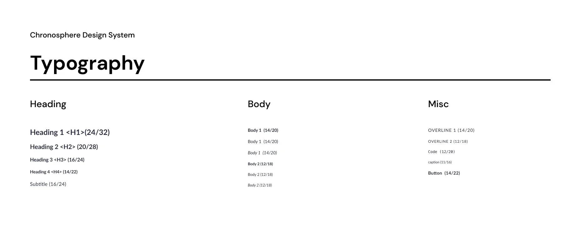
Subsequently, after exploring alternative font options, I proposed transitioning to the Inter font family, encompassing three font weights: "Regular," "Medium," and "Bold." This adjustment provided users with greater typographical versatility, contributing to an improved user experience.
Color
Upon joining Chronosphere, I noted inconsistencies in color application throughout the product, similar to the typography. After conducting interviews with relevant members of the design and branding teams, it became evident that maintaining UI alignment with the brand was imperative. Given the indeterminate future requirements of the product, I devised color palettes derived from brand colors, optimized for UI and accessibility. We maintained AA contrast ratios for all relevant scenarios.
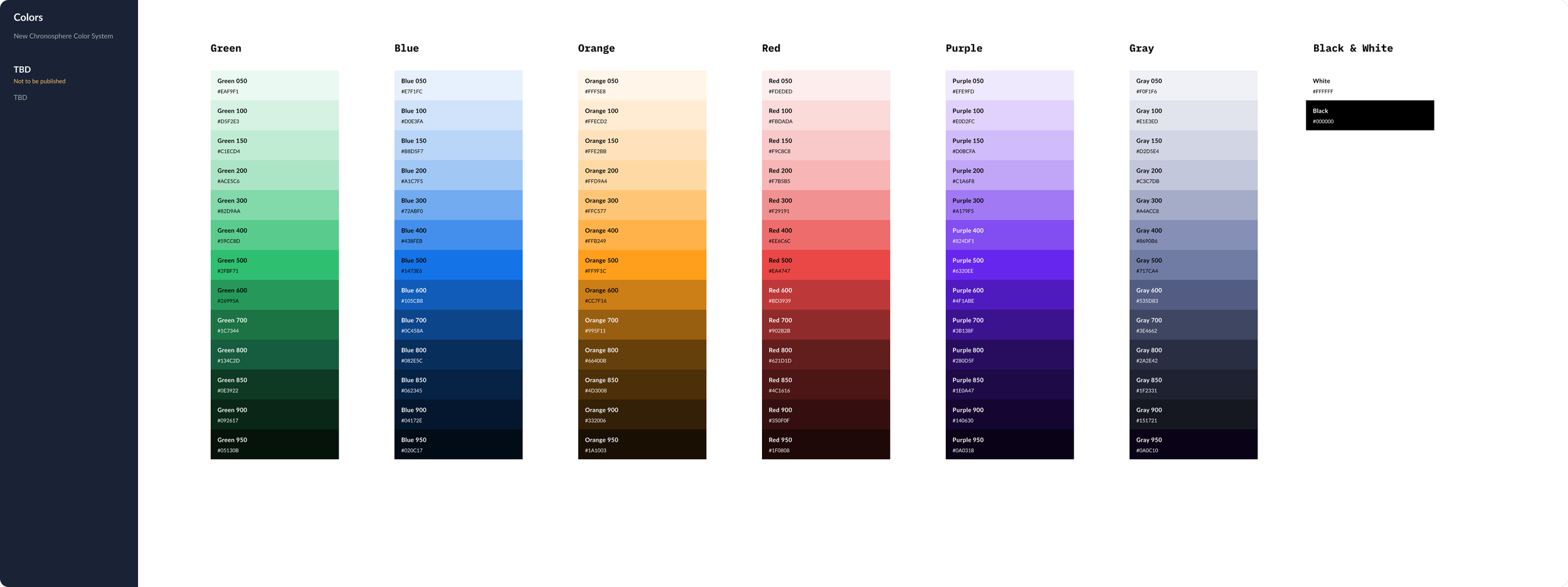
Base Color Palette
Furthermore, I ensured nomenclature closely resembled that of Material UI (MUI), enabling developers to override MUI color tokens. This strategic approach fostered a cohesive system for both designers operating in Figma and engineers working on the codebase. Neither engineers or designers had to worry about hex codes anymore and rather communicate only via color tokens.


Dashboarding framework
The Problem
In 2021, Grafana introduced revised licensing terms that compelled numerous observability users to make purchases. Initially, Grafana dashboards were integrated into the Chronosphere product using iFrames to visualize observability data. However, this approach lacked meaningful integration and resulted in a fragmented user experience. In collaboration with the French travel company Amadeus, we embarked on a mission to establish an open-source visualization framework for observability data. The eventual framework was successfully integrated into the Chronosphere product and launched as an open source software. You can check it out on github.
The Team
The core Dashboarding team compromised of a Product Manager, 4-6 front-end engineers, a backed end engineer and myself as the design lead.
Persona Research
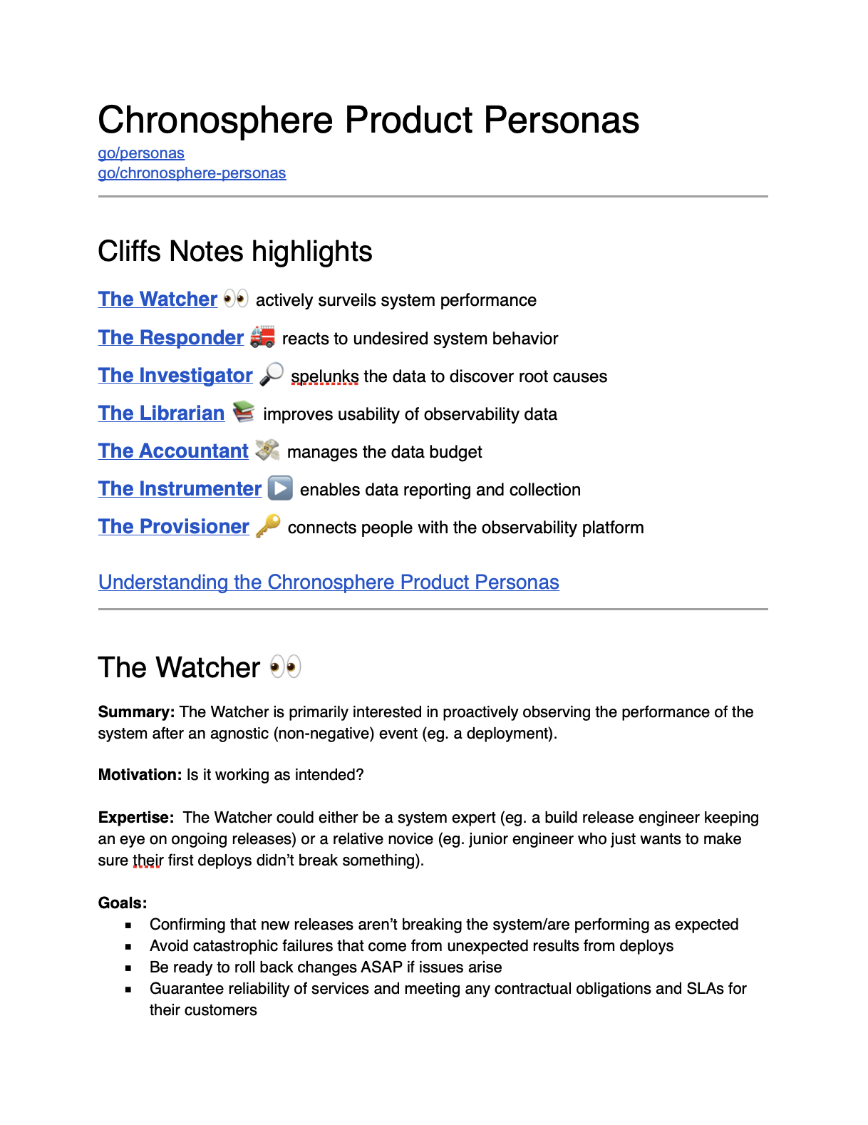
User Personas
Instead of the traditional personas based around traditional job titles, we (designers at Chronosphere) developed personas around our users consumption and relation with observability data. To create these personas, we conducted numerous research sessions via UserInterviews.com. It helped us gain understanding of how varied a customer’s observability team structure maybe given the size of the company. In a smaller start up for example, one developer may cover several of these personas, whereas at a large organization there maybe dedicated members that match more closely to a particular persona.
The Watcher 👀 actively surveils system performance
The Responder 🚒 reacts to undesired system behavior
The Investigator 🔎 spelunks the data to discover root causes
The Librarian 📚 improves usability of observability data
The Accountant 💸 manages the data budget
The Instrumenter ▶️ enables data reporting and collection
The Provisioner 🔑 connects people with the observability platform
Most of the personas created were consumers of dashboarding in one form or another. While most personas simply consumer dashboards, the Instrumenter & the Investigator typically edit and create dashboards as well.
competitive analysis - datadog & grafana
As part of my research, I conducted a massive product audit as well as interviewed users on their experience with Grafana & Datadog - two of our biggest competitors. I especially focused on Grafana, since all current customer dashboards were created with Grafana and that is the application our current users were familiar with.
I identified a few major inconsistencies in their user experience that was leading to anxiety and frustration for the users in Grafana.
Inconsistent save workflows causing confusion
Overwhelming number of feature set leading complicated UIs
Poor state management leading to accidental lose of work
However, Grafana & Datadog both had their merits to their user experience, which I learned from and applied to my own work. At the same time, a company priority was to open source this new dashboarding framework. This limited our tech stack to mostly open source libraries, since we did not have the bandwidth to create the entire framework from scratch (like Datadog).
To achieve this, I had to make clever design decisions to simplify technical complexity yet achieve a high quality user experience. Some key decisions were:
Having a consistent side panel experience to edit dashboarding entities.
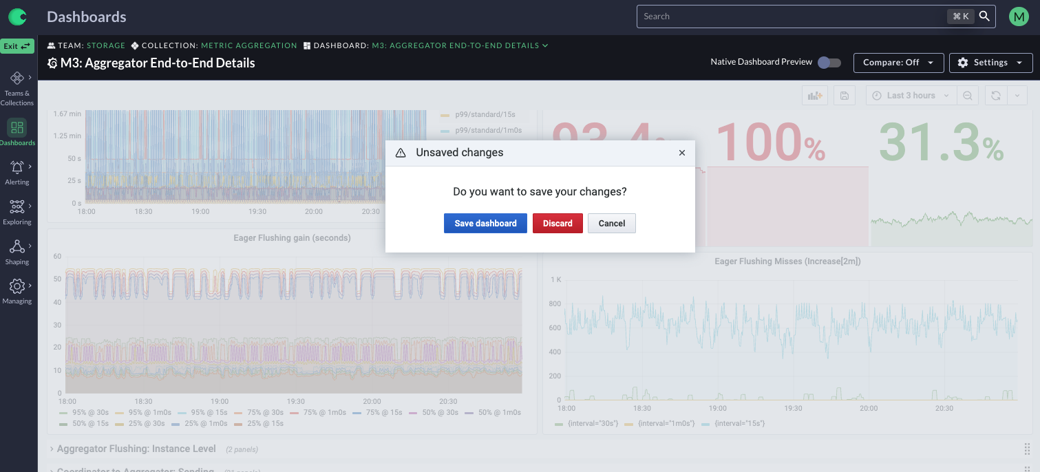
Separating the view mode and edit mode for dashboards to reduce user error and provide a superior experience tailored for each mode.
Explicit option to select default panel group state, allowing faster page load times. Data was loaded for panel groups that were open by default only.
Focusing on creating few yet highly functional visualizations that covered over 95% of the use cases.
Not compete with Grafana to try and get to feature parity, instead focus on simplifying the UI and reduce cognitive overload.
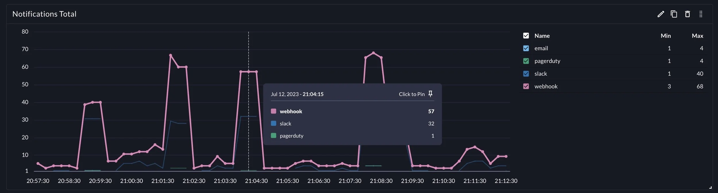
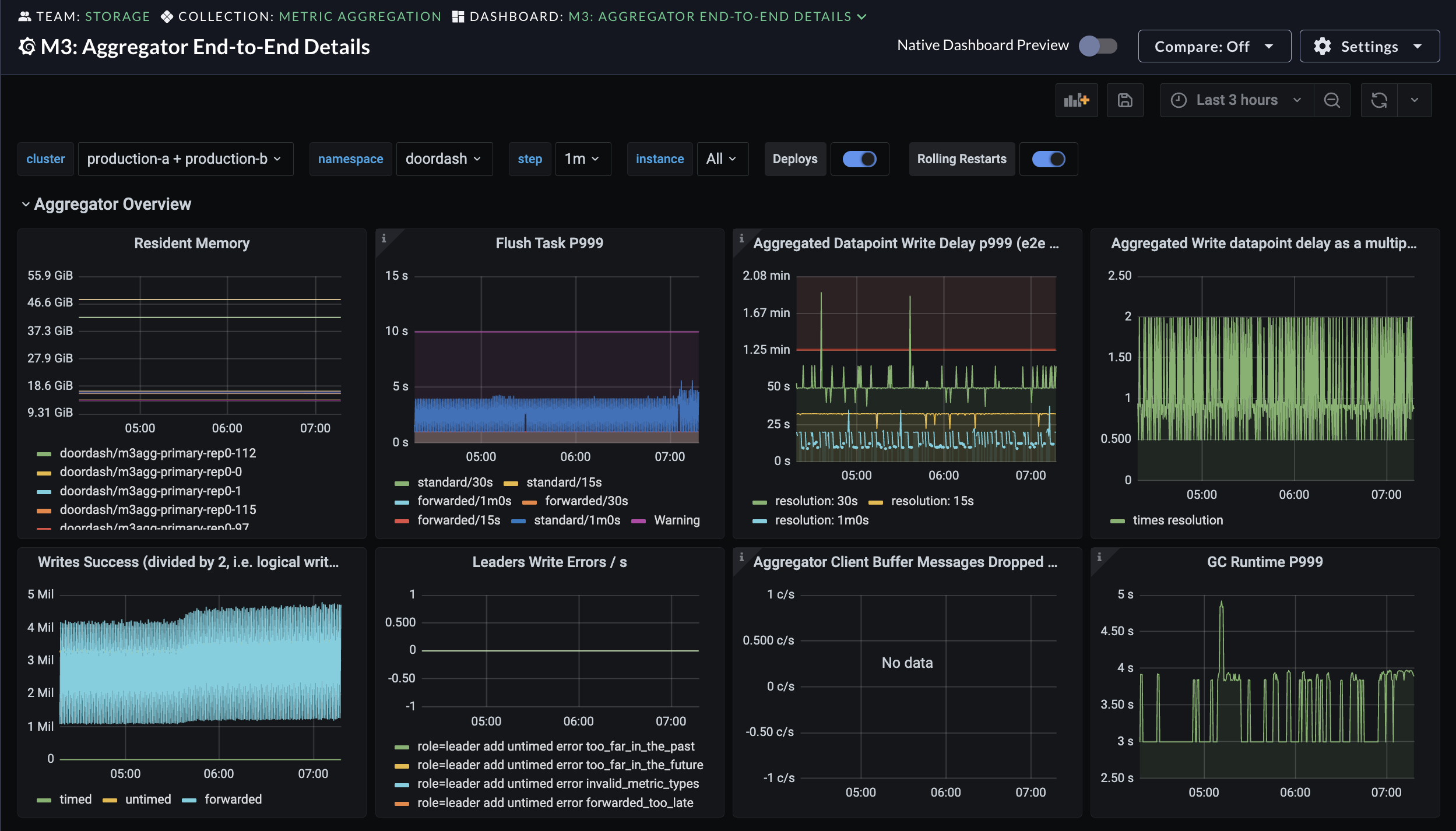
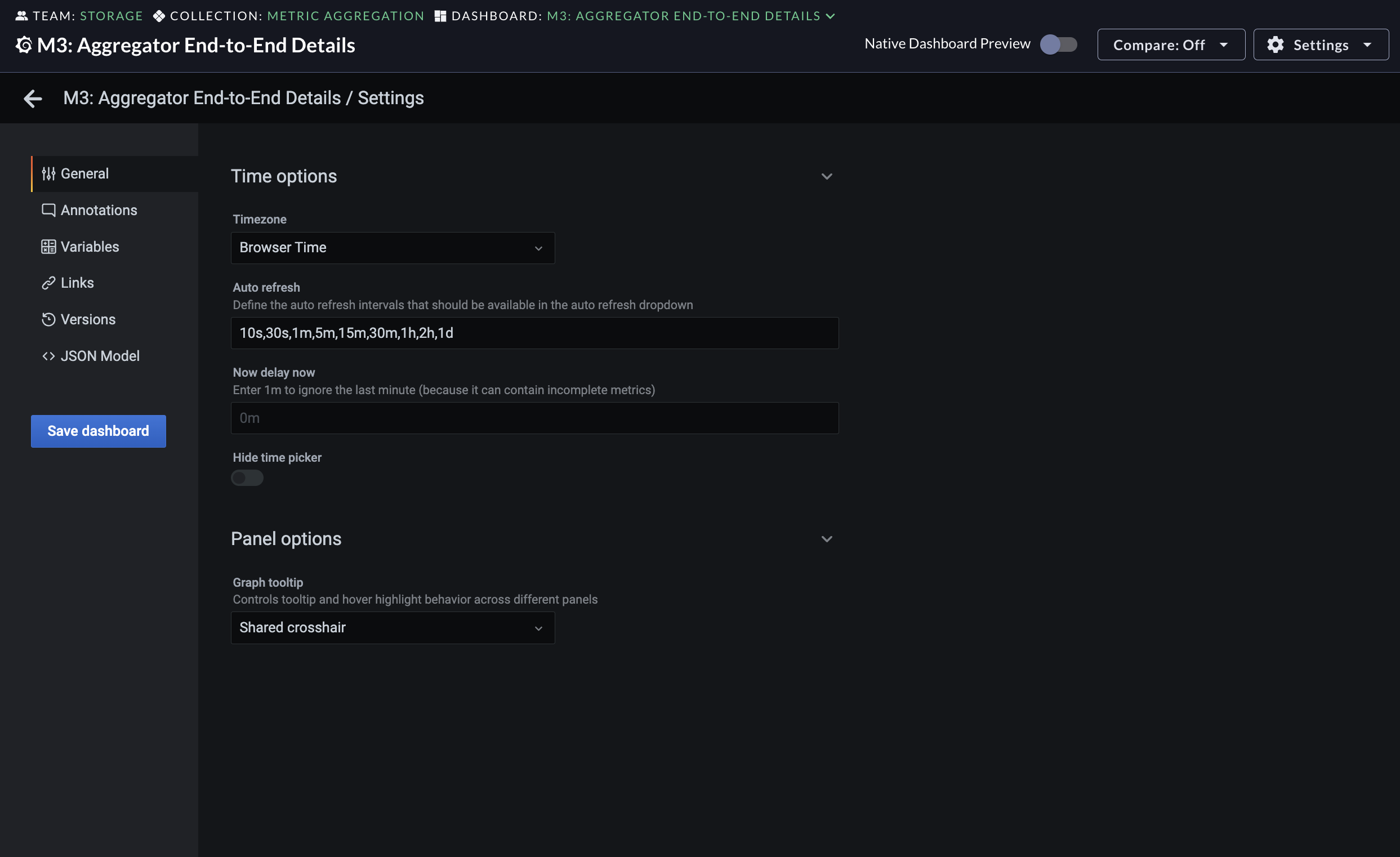
Final Output


Product Walkthrough
Walkthrough of the product showcasing - time and filter interactions, editing experience and template variables